Mid Country Value Trend, 10/1/2010
For the purpose of this study, I designated as our study zone a sample area bounded northerly by a line approximately one-half mile south of the Merrit Parkway (in order to avoid the possible influence of traffic noise), to the east by a line roughly parallel to and west of Zaccheus Mead, to the South by a line approximately one-half mile north of Putnam Ave, and to the east by Stanwich Rd.
This area was my choice, selected in an attempt to limit value variations to a degree. This geographic area was kept consistent for all years included in the comparison. I generally avoided including properties that may have been subdividable.
I focused on sales for the first nine months of each year, from 2001-2010. This allows comparison of these same spring/summer/fall markets over the and entire decade. We used data from the public sales records that could cooborated with the MLS. From the total pool of sales we dropped sales for which square footage was not reported at the time of sale. We used the sale price per square foot as the unit of comparison, rather than the overall sales price. My thinking was that since houses are growing in size, the per square foot analysis was more useful for a year to year comparison. I think it is more useful to look at what is being paid pound for apples, rather than the change in the price of the average apple is.
The purpose of this analysis is not to attempt to set a per square foot price that can be applied to all Mid Country homes. As a former appraiser I know this can't be done, since there is wide variation in value per square foot. Homes in Greenwich (and in many towns) are too different in qualities and size to set a single per/square foot unit price that reflects all homes, despite any attempt to choose a reasonably value-consistent geographical area.
What the analysis is useful for is detecting a trend from year to year. 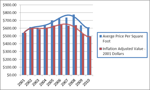
Above are the sale price averages for each year charted on the basis of square per of dwelling area (again not indicative of the value of any particular home) charted over the last decade. The blue columns represent the overall average sale prices for each of the years over the last decade. The red columns represent the same averages adjusted for inflation (2001 Dollars).
The chart suggests current 2010 nominal sales prices to be at 2002/2003 levels. The data suggest that nominal prices are potentially leveling.
When adjusted for inflation, we see that actual underlying value, measured in 2001 dollars, is less than that at the start of this century.
What is also an implication is that Mid Country may have peaked later than some other sections of town, and may be slightly less recovered; but it appears to be on a generally similar trend as we have seen for some other areas of town which we infer to have stablized sooner.
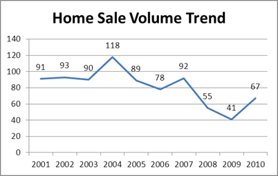
The chart below reflects the number of sale each year in the study area. As might be anticipated, increased sales volume in the early years correlates with price increases. Sales have recovered in 2010, although not as yet to early decade levels.
- John Herman Exclusive Buyer Agent
Also See: Riverside Analysis; Back Country Analysis
|